Important points
- Designers prefer versatile white and cream colors.
- Top picks include shades from Sherwin-Williams, Benjamin Moore and Farrow & Ball.
- These colors generally suit any style and lighting and are therefore universally popular.
While designers are known for experimenting with a wide range of paint colors, they also aren't afraid to try out favorites every now and then. We wanted to know: Which colors do the professionals always swear by when they work on a wide variety of rooms?
Here, three interior designers weigh in on six of the paint colors they often rely on because they work so well in a variety of spaces. Is there anything to consider beforehand? These colors are exclusively white and cream tones, proving that the shade is a classic and can really shine anywhere, regardless of the customer's style or design preferences.
Sherwin-Williams Origami White (SW7636)
Design by Karlton Kelly / Photo by Keyanna Bowen
Marya Karlton, founder of Karlton Kelly Interiors, is pleased with the effect of Sherwin-Williams Origami White (SW7636) in the spaces she designs.
“It's a really nice, soft neutral that works well with both warm and cool colors,” she says of the shade, which she describes as being somewhere between a light beige and a warm gray.
Karlton recently used this color throughout a client's home and notes that it looks beautiful in many different exposures.
“It's a good choice for anyone who wants the feel of a light, airy home but doesn't want the austerity of an all-white interior,” she says.
Want more design inspiration? Sign up for our free daily newsletter to get the latest decorating ideas, designer tips, and more!
Benjamin Moore Dove Wings (OC-18)
Karlton Kelly Interiors
Benjamin Moore Dove Wing (OC-18) is another reliable cream shade that Karlton swears by for her projects. She estimates that it's not too stark white, but also not too yellow in color due to the cream undertones and hint of gray.
“The warmth makes the room feel cozy, but still clean and not dingy,” she says.
After using the color in rooms with both warm- and cool-colored textiles, Karlton is happy to say that Benjamin Moore Dove Wing is a winner across the board. She also notes that it could be paired with lighter white trim if you want to add some contrast to a room.
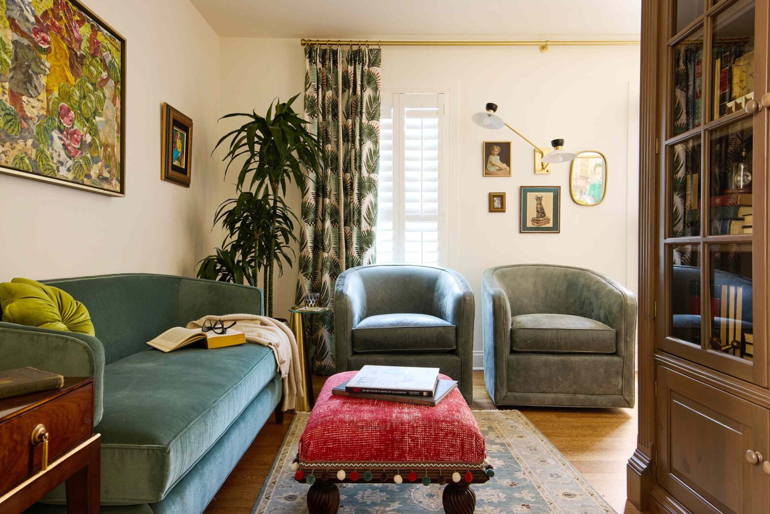
Benjamin Moore White Dove (OC-17)
Simopoulos Designs / Photo by Nicole Dianne Photography
Not to be confused with the aforementioned Dove Wing color, Benjamin Moore White Dove (OC-17) is another versatile designer favorite that, according to Lisa Simopoulos, founder of Simopoulos Designs, “is simply one of those rare whites that works in so many different styles—a lifesaver in a world where getting the right white can be frustrating find.”
In this living room, the white background brings warmer accessories into focus and the open wooden shelves add a touch of drama.
Benjamin Moore Pale Oak (OC-20)
Simopoulos Designs / Photo by Salt Haus
Simopoulos would also like to share her appreciation for Benjamin Moore Pale Oak (OC-20). She describes the color as taupe, which reads like white and can appear either warm or cool depending on the environment.
“While I love trying out options, sometimes the smartest move is to go with what you know will always work,” says the designer, who has incorporated the color into bathrooms, bedrooms, kitchens, playrooms and more.
Benjamin Moore Simply White (OC-117)
i-TEN DESIGNS / Photo by Kacey Gilpin
Ayten Nadeau, the founder of i-TEN DESIGNS, describes Benjamin Moore Simply White (OC-117) as a color that is “deceptively powerful.” She thinks it works beautifully in both neutral spaces like kitchens and more colorful, pattern-filled rooms.
“It adapts seamlessly, highlighting any design choice while maintaining its own clarity and elegance,” she says.
Farrow & Ball Schoolhouse White (No. 291)
Farrow & Ball
Nadeau says she chooses Farrow & Ball School House White (#291) when warmth and timeless softness are the goal. What makes the color so special for you?
“It’s a wonderfully warm white that feels timeless, soft and vibrant,” says the designer.
She is particularly excited about incorporating the schoolhouse's white into open floor plans because it can ease the transition between one room and another.
“It complements natural wood tones and warm finishes while providing an inviting, elegant tone,” says Nadeau.