As I delved into the moods, color schemes, and design elements we can expect in 2026, trend forecaster Rebecca Goesling, design director at Goesling Group, introduced me to the concept of “chromatic tension.” It is a technique that introduces unconventional color combinations to enliven spaces and create a clear sense of character and mood. And according to the expert, it is essential.
As neutral spaces fade into the background and color palettes become more saturated and rich, chromatic tension highlights the importance of emphasizing contrast when decorating with color. While soothing tones are crucial to creating comfort, it is equally important to awaken the senses and the mind through our interior design.
“A lack of tension can dull not only discomfort, but also joy, inspiration, and a variety of other experiences,” says Rebecca. “A healthy dose of challenging material in a room – used correctly at the right time – sparks action and triggers emotions.” So take a look around. Is your room lacking the right color balance? Here's how this cool color trend could help.
What is chromatic tension in interior design?
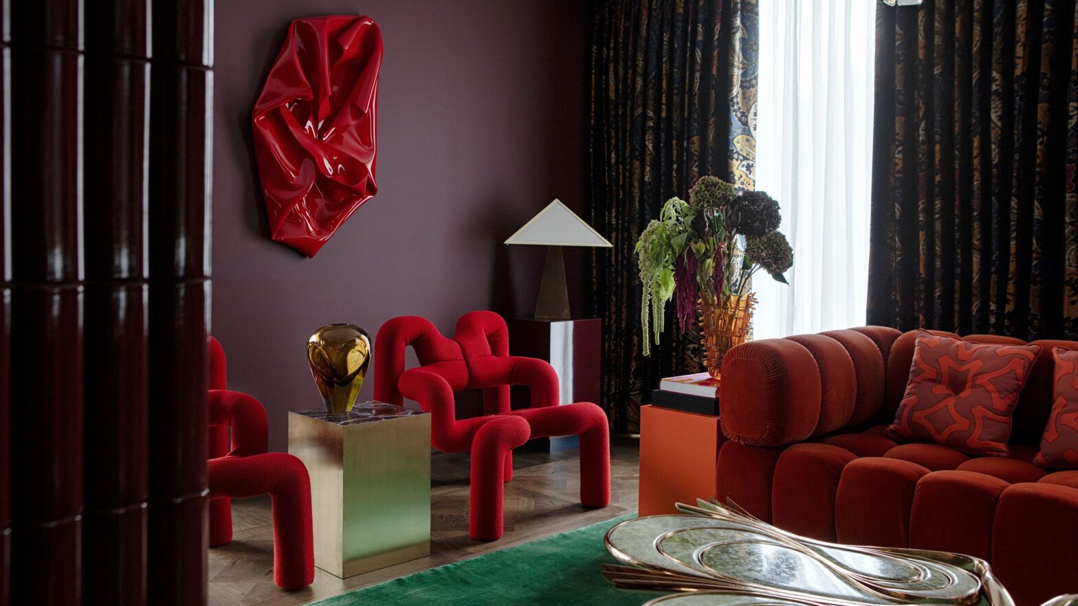
This home office not only uses complementary colors, but also implements different levels of color, textures, and materials to highlight chromatic tension.
(Image credit: Veresnovsky)
“Juxtaposed hues, be they complementary colors or colors with opposite saturations, can create a pulsating or vibrating feeling, leading to what we define as chromatic tension,” explains Rebecca Goesling.
However, color tension means more than just mixing bold colors in a room. “It’s the use of color to create visual turmoil,” says Rebecca. Yes, looking for complementary color combinations on the color wheel is a good start, but the main goal is to dramatize the dialogue between the hues, shades, tones and shades used in a single room.
For example, using a color blocking technique, while eye-catching and eye-catching, does not necessarily create excitement. This can be done in analogous hues (red to orange to yellow), similar hues (all pastels), or harmonic saturations (all midtones), but “chromatic tension requires a degree of dissonance,” says Rebecca.
Rebecca holds a BFA in Industrial Design from the University of Illinois at Urbana-Champaign, where she honed her skills in research, artistic development, and technical expertise. Rebecca Goesling is a creative force who has found her calling at the intersection of trend forecasting, color, material, surface design and brand development. With a diverse background that includes independent startups and Fortune 500 giants, she has left her mark on diverse designs ranging from decor and appliances to lifestyle brands – and her passion for discovering the new and next in design is reflected in all of Goesling Group's interior design projects.
How to use chromatic tension indoors
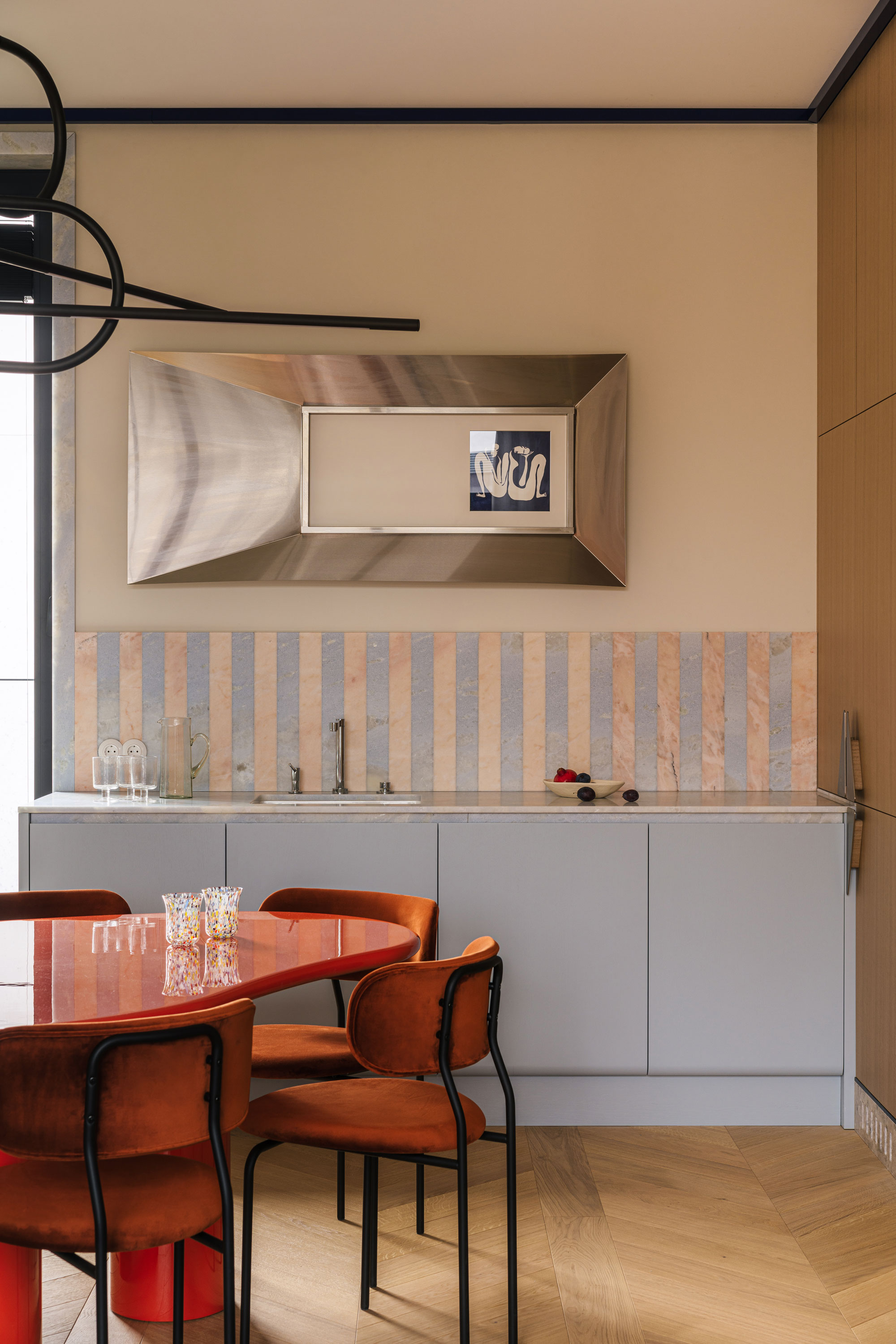
Here the lacquered dining table is in conversation with both the baby blue, matt cabinets and the chrome decor.
(Image credit: JTGrupa)
You might assume that chromatic tension requires you to commit to bold colors on your walls in order to work, and while that's the case (and in some ways a truly maximalist way to do it), it can be applied in subtle ways.
Take an unexpected piece of colorful hardware, a purple sofa in an earth-colored room, or simply combining throws and pillows. Chromatic tension uses color to create contrast in design and enliven the space in a livable way – this is the fundamental core of the technology. The way you apply the colors should be shocking and create a satisfying “eureka” moment.
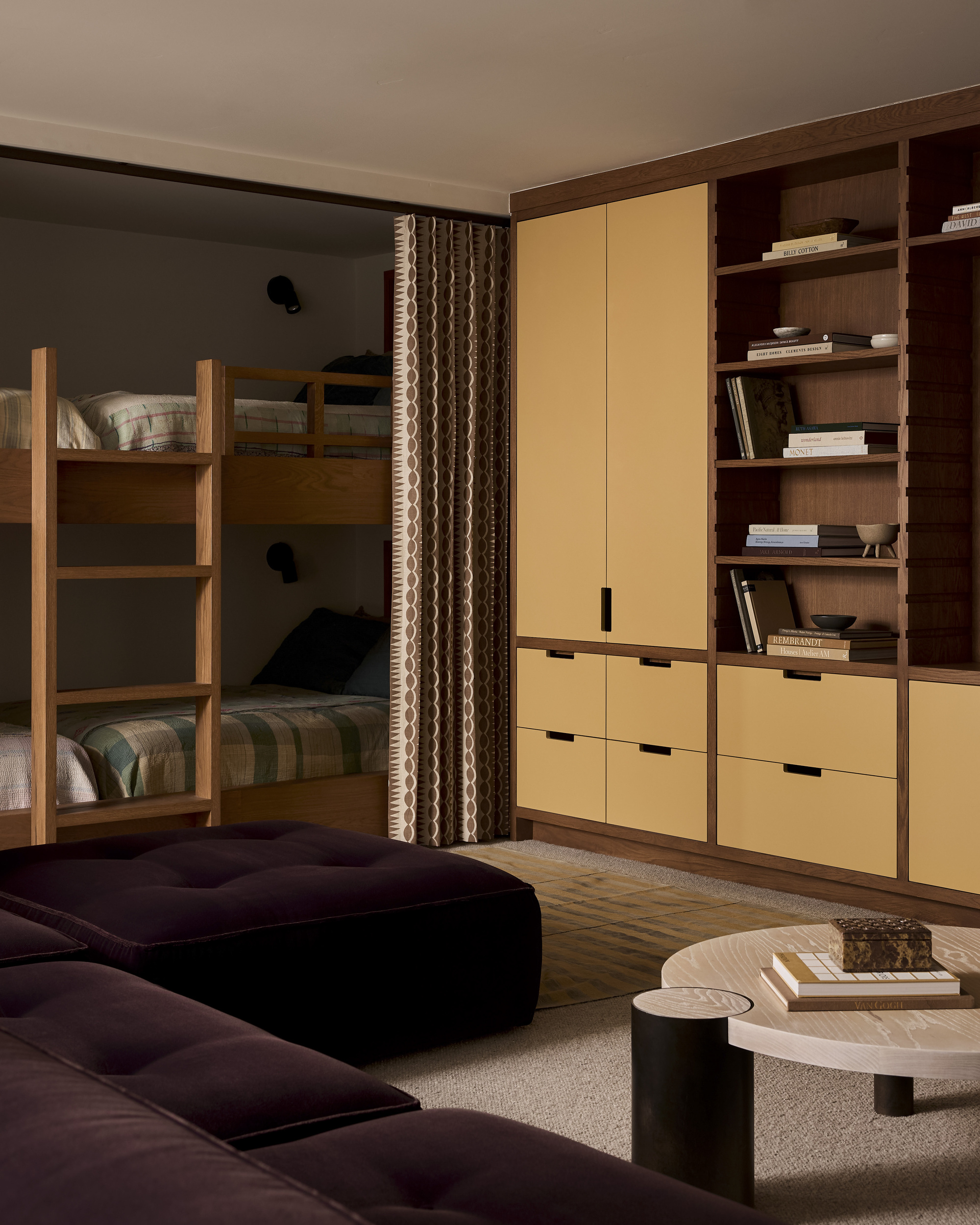
The soft but bright yellow of the wood, the deep purple sofa and the earth tones throughout the rest of the room create a subtle but effective chromatic tension.
(Image credit: Malissa Mabey. Design: Yond Interior)
“It's combinations like satin periwinkle and velvety chocolate, high-gloss chartreuse with matte baby blue, matte tangerine next to metallic moss, or magenta with a surprisingly earthy counterpart like mushrooms that are starting to get talked about,” says Rebecca of the combinations she's most looking forward to in 2026.
They all share an energetic, emotional tone balanced by a pragmatic, grounded color – “They balance frenetic emotions with soft, earthy color palettes,” she adds. But as described, playing with contrasting materials can really take these color palettes to a whole new dimension.
Below are some decorating ideas to get your color boosting journey started. The key is how you combine them.
West elm
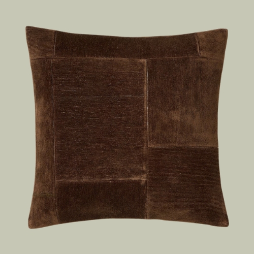
Patchwork chenille cushion cover
John Lewis
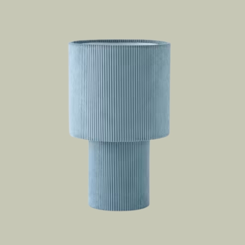
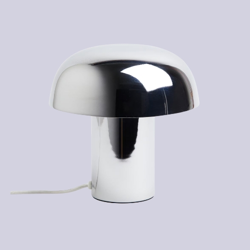
Isaac Cord table lamp
Studio X
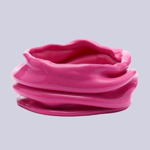
Iris Small pink ashtray
H&M homepage
Metal table lamp

Pottery Barn
Bouclé knit throw
The chromatic tension technique is a bit similar to the unexpected red theory or the strategic neon trend in that it looks for a way to use colors that experiment, delight and provide room for evolution. Do you dare to add a little intrigue to your interior?